In the bustling world of data science, the ability to transform raw numbers into visually appealing and insightful stories is a superpower. Data visualization techniques are the tools that enable data scientists to communicate complex ideas effectively, persuade stakeholders, and uncover hidden patterns. Let’s dive into some must-know data visualization techniques that every data enthusiast should have in their arsenal.
1. Histograms: Unveiling Distributions
Histograms are the go-to technique for understanding the distribution of a single variable. By grouping data into bins and displaying the frequency of each bin, histograms help reveal the underlying shape of the data, such as normal distribution, skewness, or the presence of outliers. For instance, if you’re analyzing the age of customers, a histogram can show if most customers fall within a certain age range or if there are unexpected spikes.
2. Box Plots: Spotting Outliers
Box plots, or box-and-whisker plots, are excellent for summarizing the distribution of a dataset and identifying outliers. They display the median, quartiles, and potential outliers in a compact form. This technique is particularly useful when comparing distributions across different groups. For example, comparing the test scores of students from different schools can reveal not only the central tendency but also the spread and any outliers.
3. Scatter Plots: Exploring Relationships
Scatter plots are indispensable for investigating the relationship between two continuous variables. By plotting one variable on the x-axis and the other on the y-axis, scatter plots can reveal correlations, clusters, and trends. When analyzing marketing data, a scatter plot might show the relationship between advertising spend and sales revenue, helping to identify whether higher spending correlates with increased sales.
4. Heatmaps: Visualizing Intensity
Heatmaps use color to represent data values, making them perfect for visualizing the intensity of variables across a matrix. They’re particularly effective for displaying correlations between many variables or for showing how a variable changes across two dimensions. For example, a heatmap can reveal the correlation between different features in a dataset, highlighting which pairs of features are strongly related.
5. Bar Charts: Comparing Categories
Bar charts are a staple in data visualization, ideal for comparing quantities across different categories. Whether you’re comparing the sales performance of different products, the population of various countries, or survey responses, bar charts provide a clear and straightforward comparison. They can be oriented vertically or horizontally, depending on the data and the available space.
6. Line Charts: Tracking Trends Over Time
Line charts are perfect for visualizing trends over time. By connecting data points with lines, they show how a variable changes over continuous intervals. Line charts are commonly used for time series analysis, such as tracking stock prices, website traffic, or temperature changes over days, months, or years. They can also include multiple lines to compare different datasets on the same graph.
7. Pie Charts and Donut Charts: Proportions at a Glance
While often debated among data scientists, pie charts and their cousin, donut charts, can be effective for showing proportions when used correctly. They are best suited for displaying the parts of a whole, such as market share distribution among companies or the percentage of budget allocation. The key is to limit the number of slices to avoid clutter and ensure clarity.
8. Bubble Charts: Adding a Third Dimension
Bubble charts take scatter plots to the next level by adding a third dimension through the size of the bubbles. This technique is useful for visualizing three variables in one plot. For instance, in a marketing campaign analysis, a bubble chart can show the relationship between advertising spend and sales revenue, with the bubble size representing the number of customers reached.
9. Violin Plots: Combining Density and Box Plot
Violin plots merge the benefits of box plots and density plots. They not only show the summary statistics of a dataset but also illustrate the density of the data at different values. This dual functionality makes them powerful for comparing distributions. Violin plots can be particularly enlightening when examining the distribution of test scores across different classes or the spread of salaries in various job roles.
10. Geospatial Maps: Location-Based Insights
Geospatial maps are essential for any analysis involving location data. By plotting data points on a map, they provide intuitive insights into geographic patterns and trends. Whether it’s visualizing customer distribution, tracking delivery routes, or analyzing regional sales performance, geospatial maps bring location data to life. Tools like choropleth maps, which use color to represent data density, can be particularly impactful.
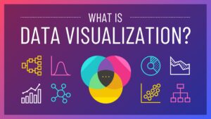
What is Data Visualization
Data visualization is the graphical representation of data and information using visual elements such as charts, graphs, maps, and other visual aids. Its primary purpose is to communicate complex data in a clear, concise, and insightful manner, making it easier for users to understand patterns, trends, and relationships within the data.
At its core, data visualization transforms raw data into visual representations that can be easily interpreted and analyzed. It leverages human visual perception to convey information more effectively than raw data alone, enabling users to quickly grasp key insights and make informed decisions.